Design · Brand identity · Gurgaon
A back, a stride, a mountain. There's a Monk in all three.
Gurgaon has a gym on every corner. Monk was built to compete on identity instead of equipment.
Brand identity, Gurgaon.
Context
Monk is a performance gym in Gurgaon for people who treat training as a lifestyle rather than a trend. Professionals protecting their health, members who want focused, distraction free work.
The category sells facilities: equipment, floor space, membership tiers. Facilities are interchangeable, so the brand had to be built on something that is not.
The question
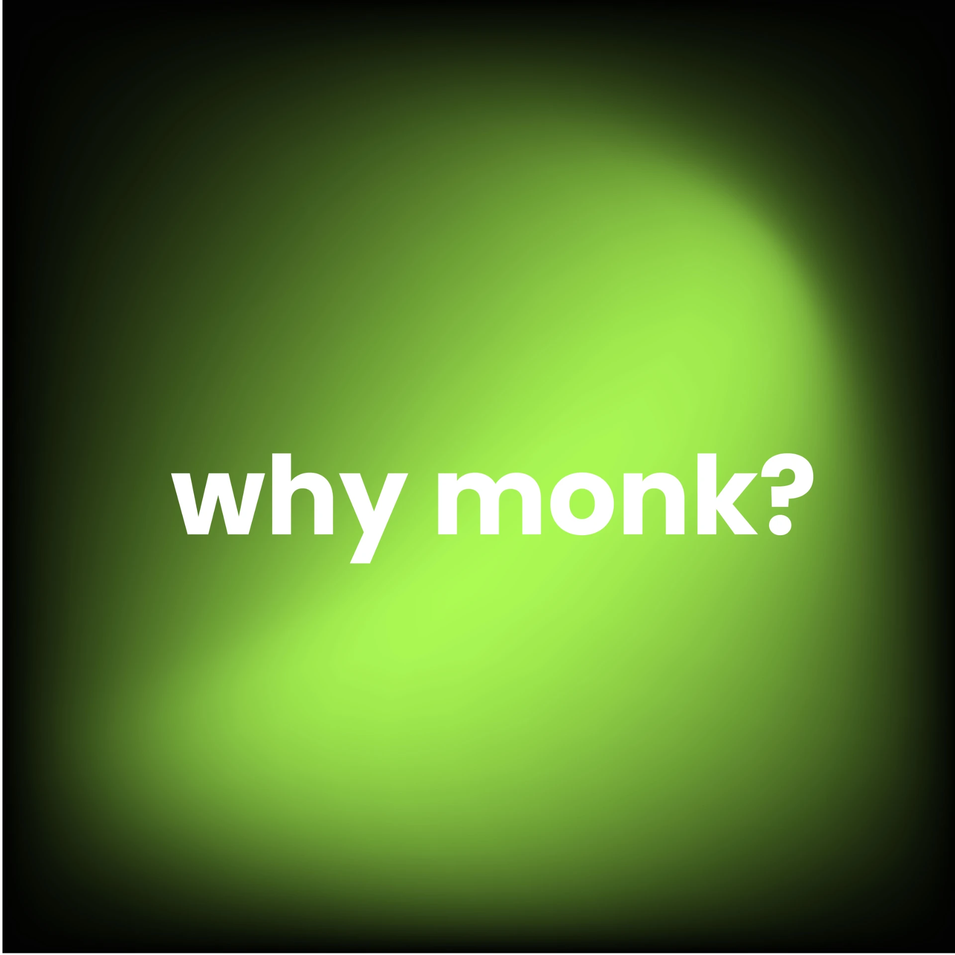
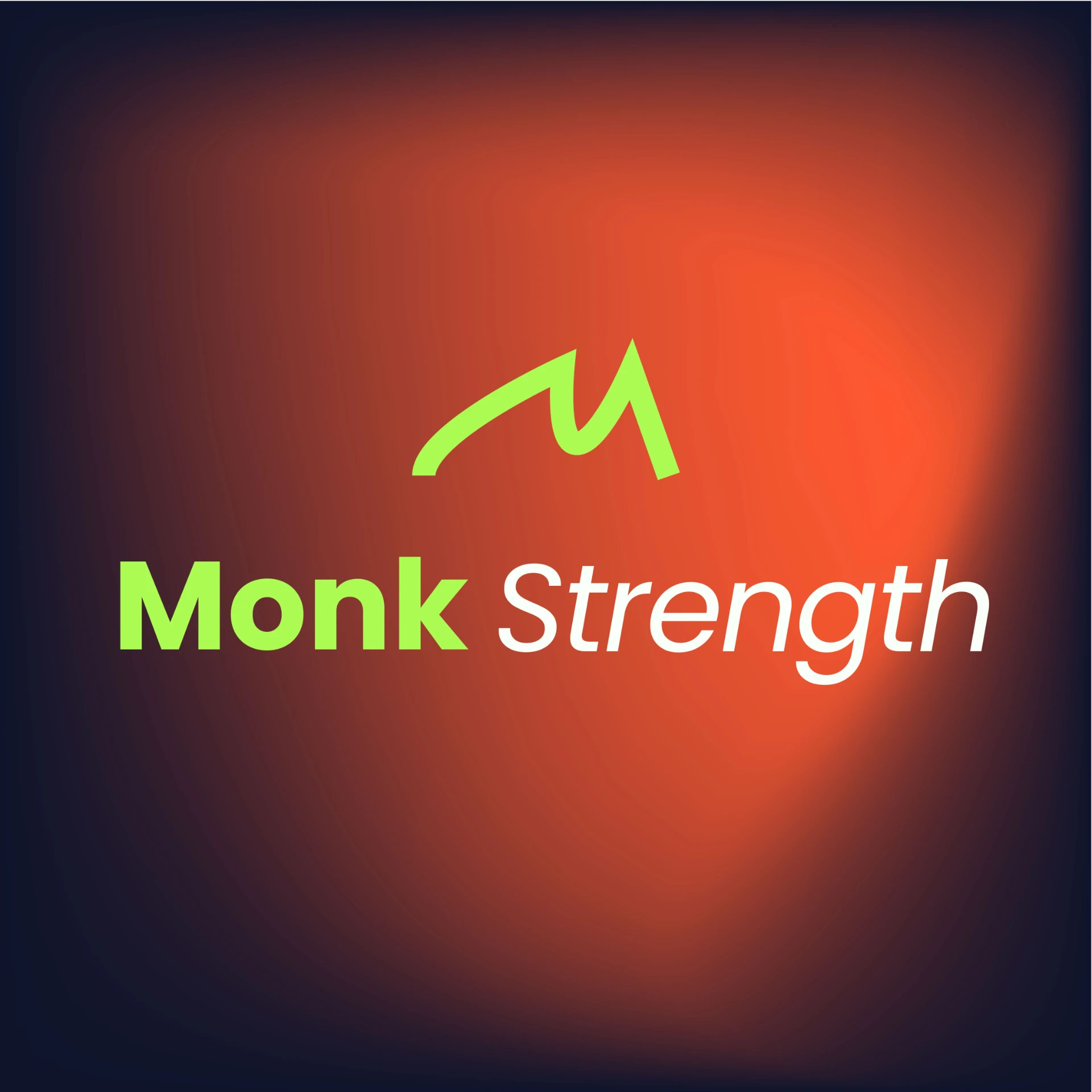
Everyone training has a why. The green is the spark right before a heavy set, and the question is aimed at the reader rather than the gym.
The answer
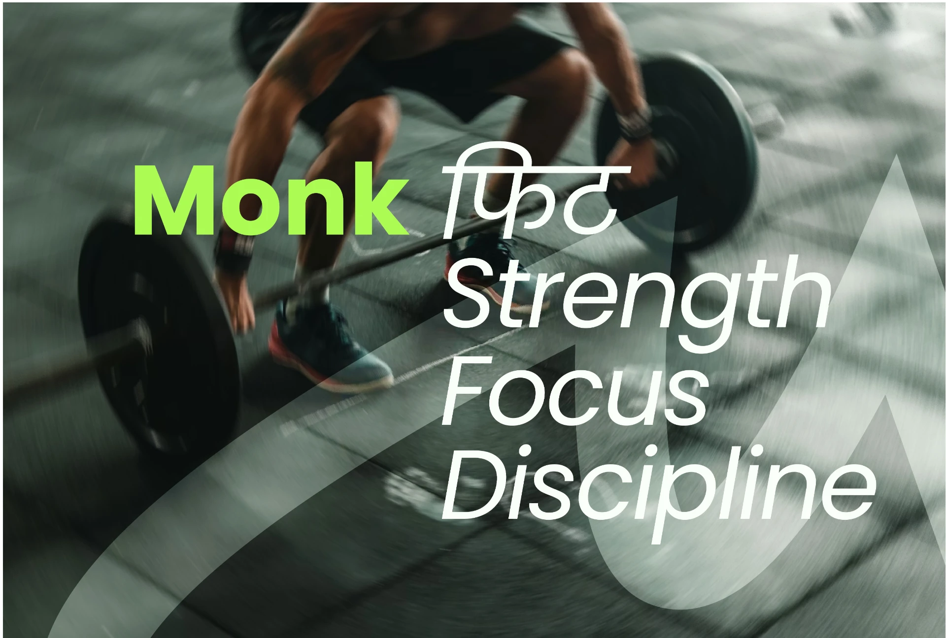
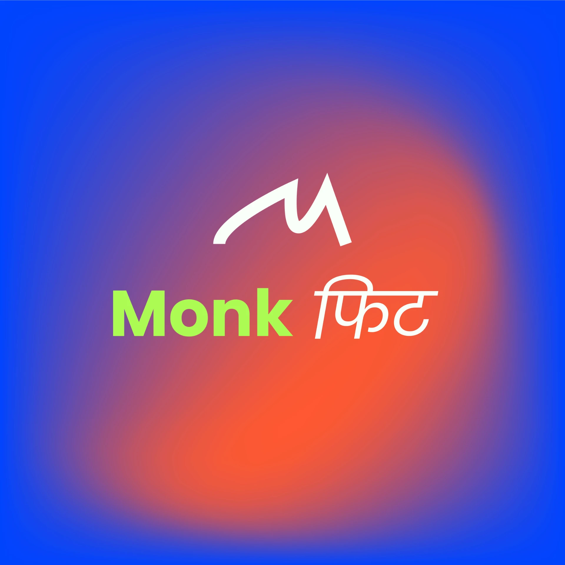
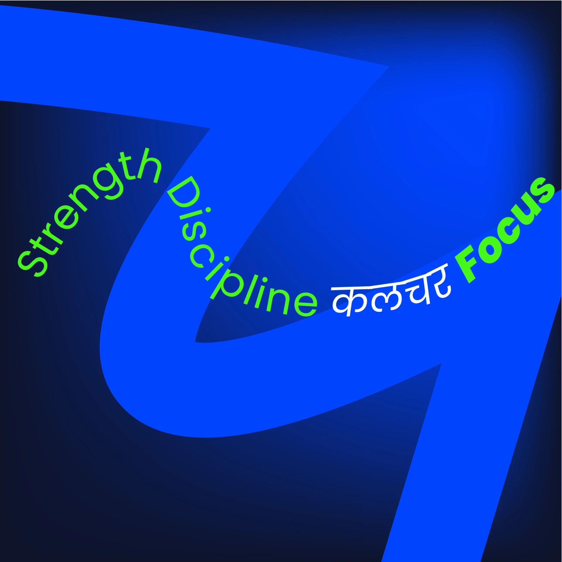
Strength, Focus, Discipline, written as Monk फिट. The Hindi script keeps the brand rooted in the city it belongs to instead of reading like a global chain translated into it.
The mark
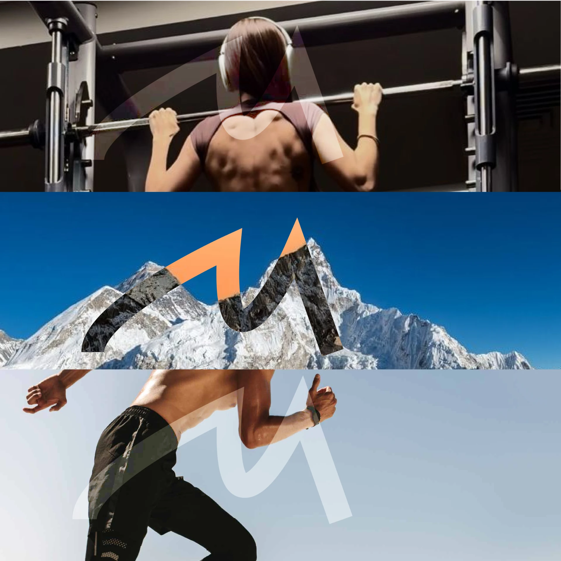
- 01
Human strength
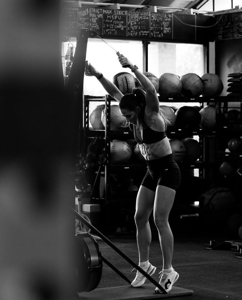
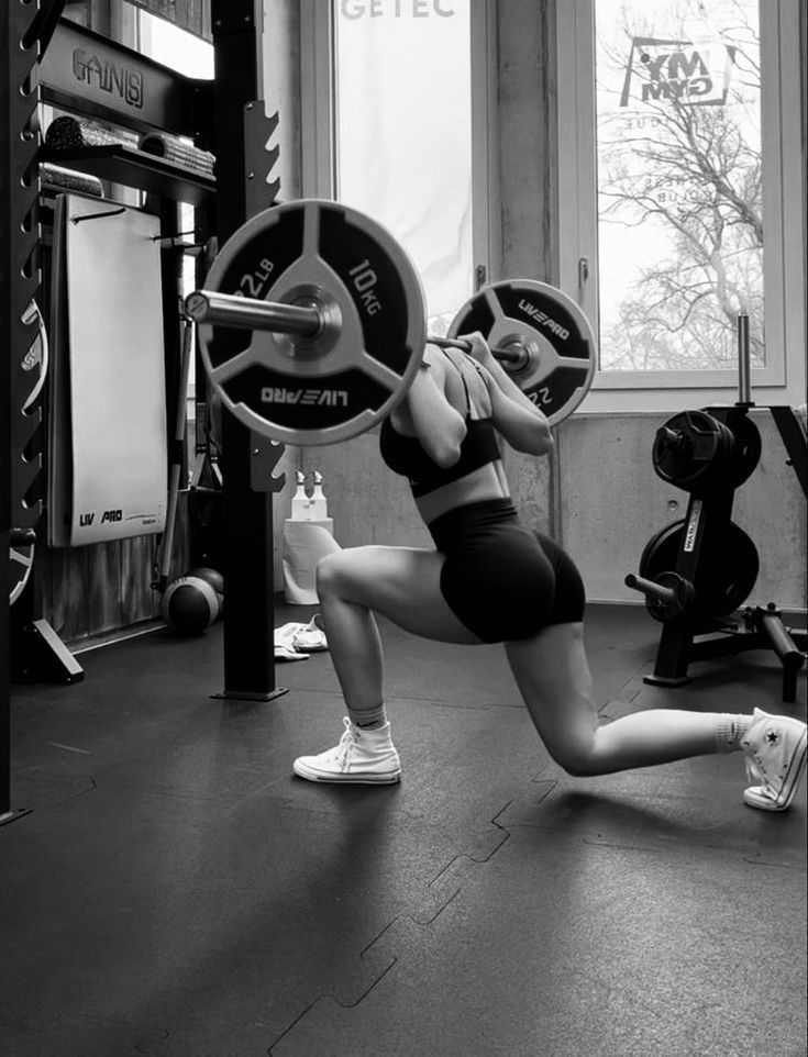
From a woman's back during a pull up. The M represents the physical foundation, the grit and muscle required to start the journey.
- 02
Dynamic motion
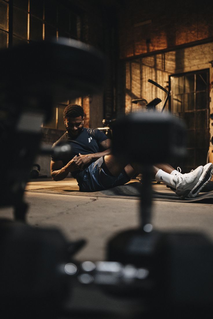
From the man running. The logo captures the kinetic energy and fluid momentum of an athlete in full stride.
- 03
The summit
From the mountain peaks. It reflects the monk's home, a symbol of reaching the top and achieving mental and physical elevation.
“Monk isn't just a name. It's the geometry of performance.”
The system
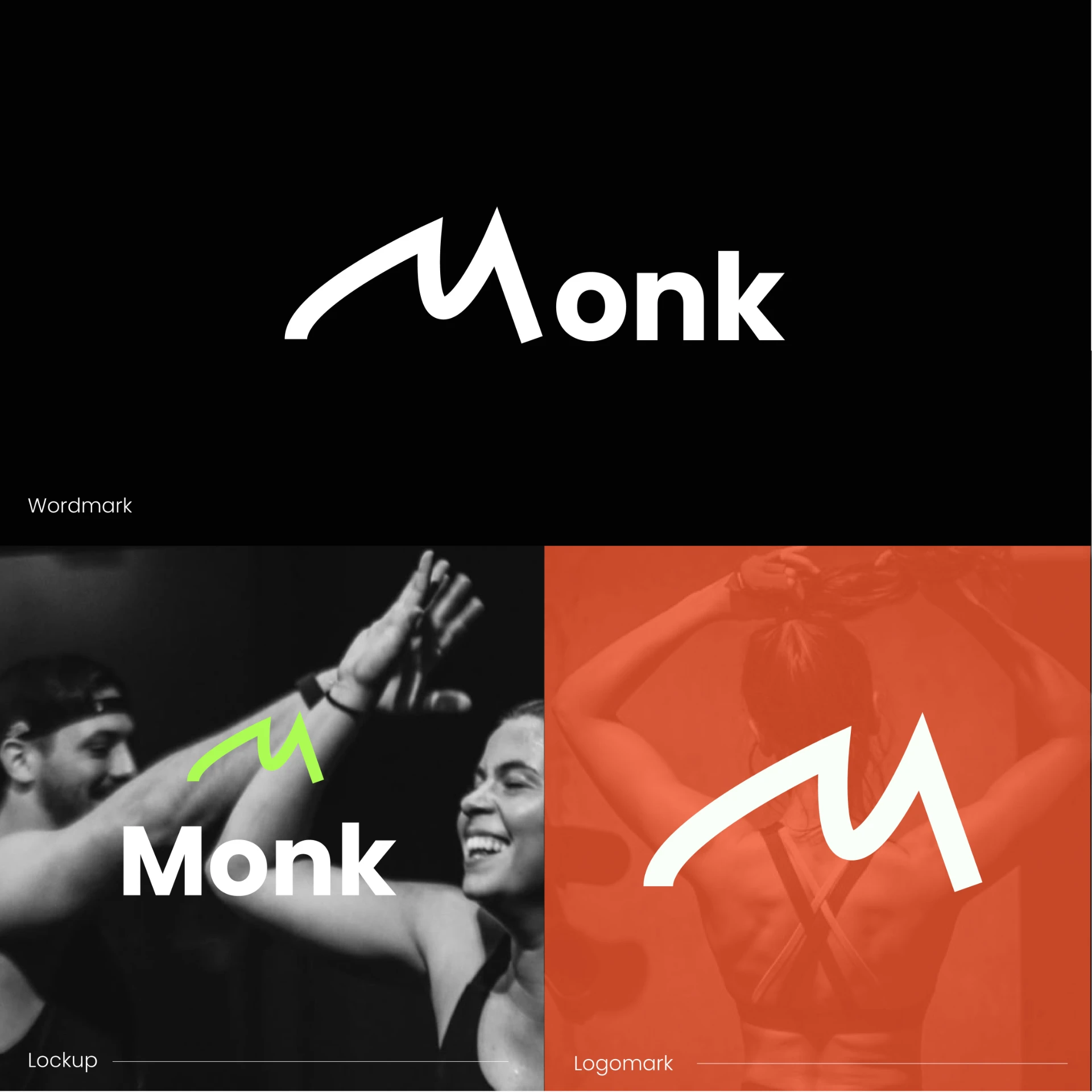
Wordmark, lockup and logomark, built so the M can eventually stand on its own without the name beside it.
Palette
Black
#000000
Neon green
#ABFA54
Neon orange
#FF5930
Ink
#0D142B
Azure
#0044FF
Off white
#FAFFFA
Neon against ink, with the greens and blues carrying the energy and the ink holding it together.
The feed
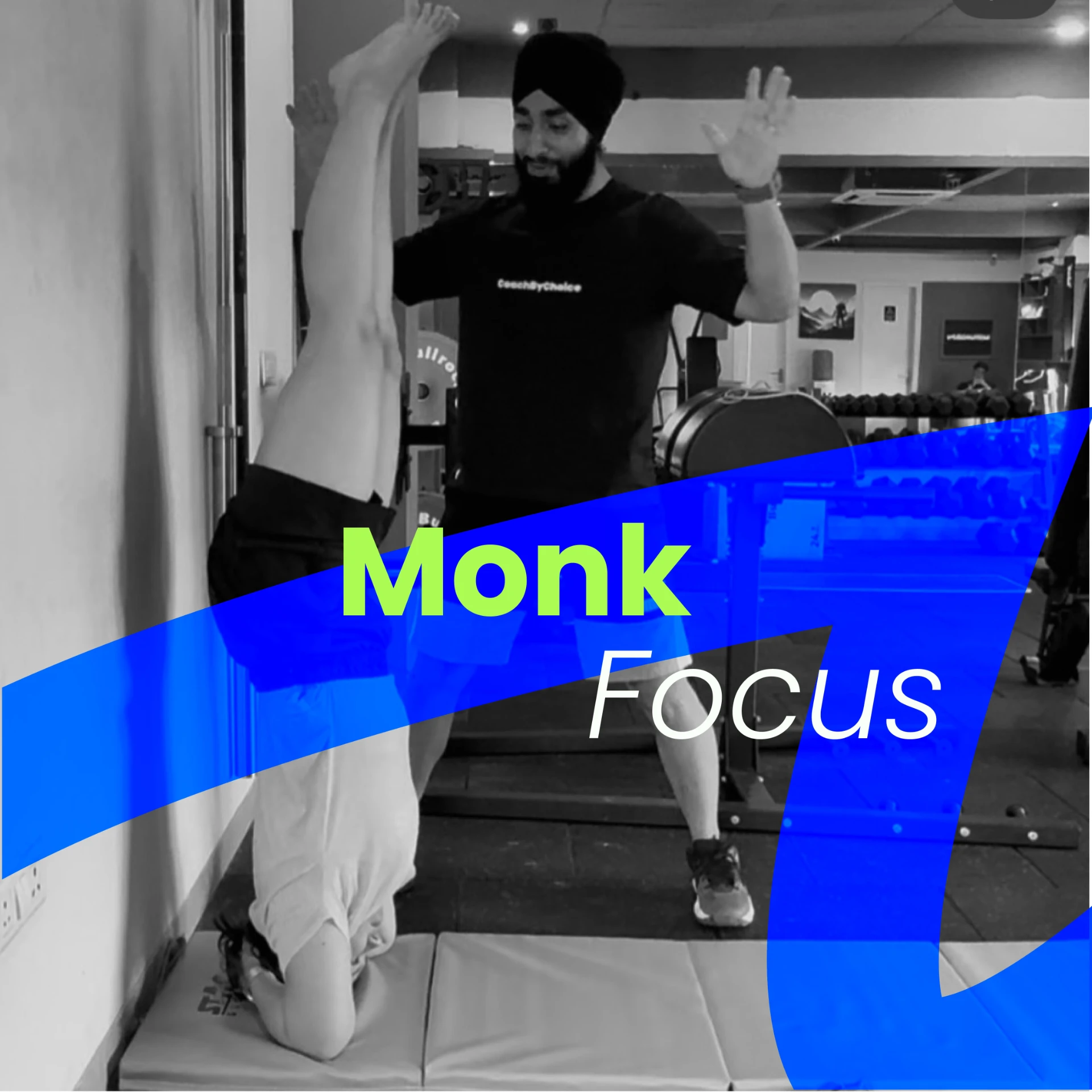
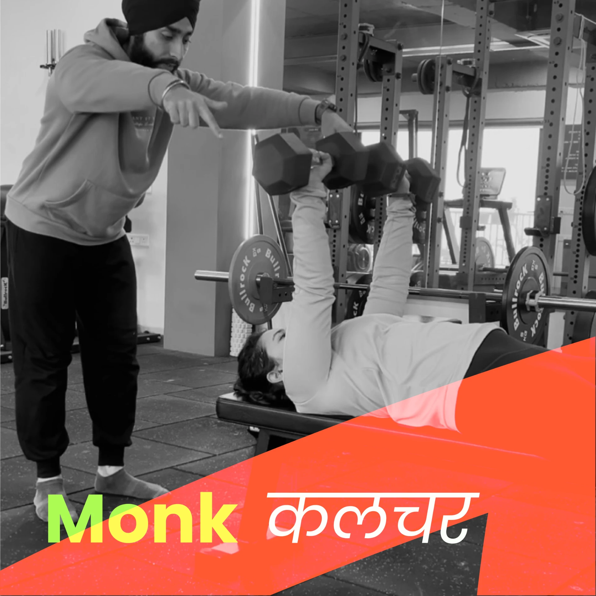
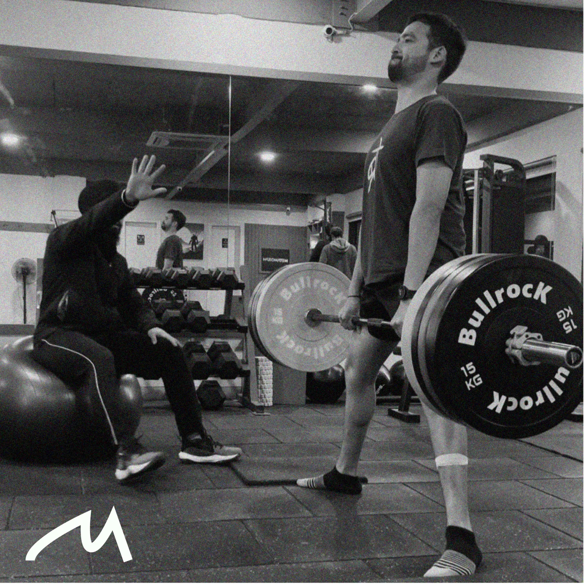
In a city with a gym on every corner, the feed had to feel alive rather than informative. Vibrant colour, movement, and local language, aimed at the Gen Z and millennial audience the gym wants.
Gear
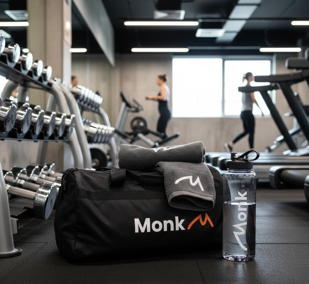
Applied to what members actually wear and carry, which is where an identity either holds up or falls apart.
Not just a logo. A standard for how we train.
Also see
All design work