01
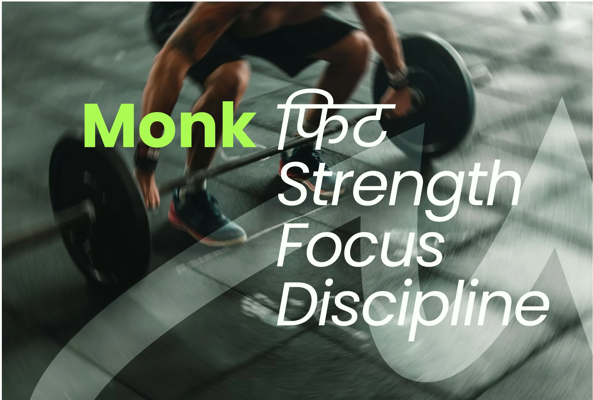
A back, a stride, a mountain. There's a Monk in all three.
Role: Brand Identity
A full identity system for a new fitness brand, built to scale from day one.
Context
A new studio launching into a category full of loud, interchangeable branding. The founders wanted something calmer and more deliberate that would still work at small sizes and in-gym.
Challenge
A new fitness brand needed an identity that felt considered rather than generic.
Approach
- 01Positioned the brand against the category before drawing anything.
- 02Designed the mark, type system and palette together rather than in sequence.
- 03Applied the system across signage, digital, apparel and print to prove it held up.
Outcome
Created the identity system — logo, type, colour and application — ready to scale across digital and print.
- Logo and mark
- Type and colour system
- Application suite
- Brand guidelines
IdentityDesign system
Work
26 images — click to enlarge
Next